Human-Centered Design & Engineering at the University of Washington
Seattle Architecture Foundation
Product Description:
Design a cohesive visual system for a non-profit client. I chose the Seattle Architecture Foundation (SAF). First, because their work appeals to me. Seattle is changing architecturally; the shift is important to document not only for aesthetic reasons, but also because it enables us to interrogate the design decisions being made – why, for whom, how did it work? Second, because their website seemed prime for an update, not only to make it more usable, but to bring it closer to the organization’s area of expertise.
This project was done for class and hasn’t been proposed to SAF, although I did tour and briefly interview members of their staff.

Moodboard
Client

About
Seattle Architecture Foundation provides programming and opportunities for involvement to people of all ages and backgrounds with an emphasis on youth and family engagement. They do so through walking tours, lectures, and other events around Seattle.
In their own words
“The Seattle Architecture Foundation connects people to the architecture, design, and history of Seattle. We believe the more you engage with design, the more you feel connected to your changing city.”
Core Values: Education, Empowerment, Excellence, Community, Equity, Volunteerism, Integrity
Communication goals
Education
Community Involvement
Represent Seattle’s architectural past and present

Logo

Abstracted lettermark
Simple
Scalable
Grid systems
Web pages – Home and Downtown Tours
For my web view, I use a 12-column vertical grid with 10 pixel gutters. With some exceptions for visual balance, (I break the grid with boxes and buttons and on one occasion an H2), the text and other elements are aligned left and to the left of the nearest column. Horizontally, I use breaks of 200* between content sections, 100 between section headings and section text/content, and 30 between body copy and headings. There are exceptions: 40 and 18 between text blocks in the Visit Us section and Navigation menu respectively.
Mobile page – Home
The homepage on mobile shrinks to a 8-column vertical grid with 10 pixel gutters. Horizontally, it uses spaces of 40 H1 and any top buttons and 80 between H2 and content. Within content sections, there are 10 pixels each between headers, content blocks, and links; there are 80 pixels within content sections between content groups. An exception is made in the Visit Us section with 40 pixels between H2 and content, with 24 pixels between each content block. H3 is centered, otherwise text is aligned left and to the left of the grid with some exceptions with buttons and images.
Poster
My poster uses an 8-column vertical grid; I did not use a horizontal grid for the elements. Text (with two exceptions) is aligned left and fixed to the left of the closet grid column. *All measurements in pixels
Typography

Color

Imagery
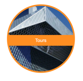
My redesign populates the Seattle Architecture Foundation’s site with high-resolution photography of – what else? – Seattle’s architecture. Photography on the site should be used photography to open things up visually with an on-the-street perspective and plenty of sky and natural light to align with the color palette.
I used imagery of people sparingly. When I do include them, I want to make sure they are active (taking photographs, as in a tour environment), show a range of ages and demographics, and are shown in groups to add a dynamic, community feel.

Home page
Original (existing) home page
Lo-fi wireframe
Higher fidelity wireframe
Final version
Downtown Tours page
Original (existing) Downtown Tours page
Lo-fi wireframe
Higher fidelity wireframe
Final version
Promotional poster
Alternate, grayscale version of poster
Final poster